Tuesday, September 27, 2011

Trees


Flowering Dogwood -- Cornus florid
American Holly -- Ilex opac

Live Oak -- Quercus virginian


Southern Magnolia -- Magnolia grandiflora


Long-leaf Pine -- Pinus palustri

Sunday, September 25, 2011

Rivertime Extravaganza!

So we went to the river and did a lot of stuff. Well, I picked up trash, but other people did lots of interesting things with measurements and strings and flow and all that info.

This map that follows is a map of clam concentrations on the river. From this map, we learned that clams like more shallow water. The deeper water had fewer clams. We also learned that birds or other animals will dig up the clams on the sand banks/bars and eat them, which is why there were no living clams sometimes.


The second map is the river transec map. I was not part of the group that collected this data, so I made the map with four equally divided parts in order to give an estimation of the number of feet across the river. By comparing the map I have made with the graph that follows it, it becomes easy to see the shape of the river bottom.


Thursday, September 8, 2011

More Maps!

This is a map I made using Google Earth. It is of the Ocmulgee National Monument. I have a place marker, a colored area of the swamp lake, and a path showing how to get from the first mound to the temple mound.

Wednesday, September 7, 2011

MAPS!

Map 1: Dot Density
A dot density map uses dots as a way to show the concentration in a particular area as shown by a data set. For example, if a dot is 1 million people, major cities in the United States would have a dense number of dots on them compared to rural areas, which would have very few. Dot density maps are useful for showing the number of things, events, or occurances over a large area.

Map 2: Chloropleth
A chloropleth map is one that uses distinct areas, and shading of those areas, in order to convey information about those areas. Political maps used to show the swaying of states toward Democrats and Republicans are often chloropleth maps. The colors used in the map usually convey a density of concentration--an election map that is deep red is associated with a Republican state is contrasted against a light red state that is not as strongly associated with the party.

Map 3: Isarithmic
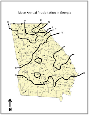
It's a kind of map that shows the areas where things occur. For example, one would use an isarithmic map in order to show weather patterns in an area. The cordoned off pieces of the map are called chorograms. They show distinct pieces of data that separate sections of map, comprised of data sets, off from other, different sections.

For example, I have created the isarithmic map of rain fall patterns in GA below.


Monday, September 5, 2011

Blog 1: CAPYBARA!


I think the Capybara is really cool. This picture is particularly cool because it has a boss little dude being all, "Hey bro, touch noses!" and the mother capybara is all, "I'm way bigger than you." It is also the largest rodent in the world. A giant rat. Or, like, a giant squirrel.

Here is a video of a capybara doing all kinds of stuff for a frozen treat! I would slide down a slide for a frozen blueberry yogurt!